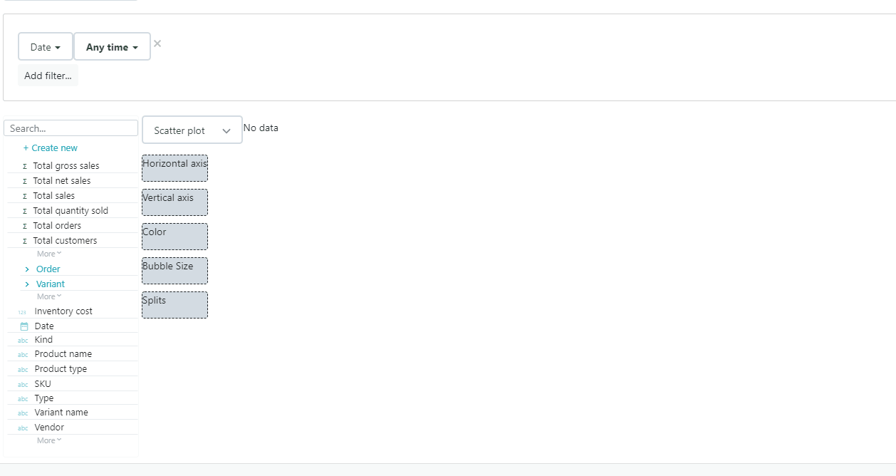
Scatter plot report roles
Name | Type | Cardinality |
Horizontal axis | Measure | 1 |
Vertical axis | Measure | 1 |
Bubble color | Dimension | 0 or 1 |
Bubble size | Measure | 0 or 1 |
Split | Dimension | 0 to many |
Use scatter plots to visualize the correlation between two numeric variables.
- Assign a measure to the horizontal axis
- Assign a measure to the vertical axis
- Assign a color dimension to create a colored bubble for each dimension value (optional)
- Assign a measure to size the bubbles (optional)
- Assign one or several split dimensions to further splits into additional bubbles